Double R Brokerage: Building a Brand from the Ground Up

Strategic focus:
Brand Identity & No-Code Development
Domain expertise:
Logistics & Supply Chain Management
Project duration:
Full Life-Cycle: Conceptualization to launch
Platform scope:
Custom Webflow Site (Live)
Project Overview: Zero-to-One Brand Orchestration
The Challenge: Establishing Trust in Logistics
In the high-stakes freight brokerage industry, digital presence is the primary driver of credibility. Double R Brokerage, a startup focused on U.S. logistics, lacked any visual or digital identity. My mandate as the Sole Creative Lead was to architect a comprehensive brand and a high-performance "digital storefront" that would immediately establish trust with shippers and carriers.
My Strategic Role
I served as the Product Owner and Lead Designer/Developer, managing the entire lifecycle from brand conceptualization to no-code deployment. I didn't just design pages; I defined the visual and verbal language of the business, ensuring every touchpoint communicated reliability, movement, and industrial professionalism.
Quick Details
- Role: Sole Creative Lead (Branding + UX/UI + Webflow Dev)
- Timeline: Concept-to-Launch in weeks
- Outcome: A live, production-ready digital asset for B2B lead generation

Exploration & Discovery: Architecting a High-Trust Identity
Market Positioning & Industrial Mental Models
In the logistics sector, reliability is the primary currency. I began by auditing the digital landscapes of established freight brokerages to identify the visual "mental models" that shippers and carriers associate with safety and efficiency. My goal was to move beyond the generic "trucking" cliches and build a brand identity that felt both industrial and technologically modern.
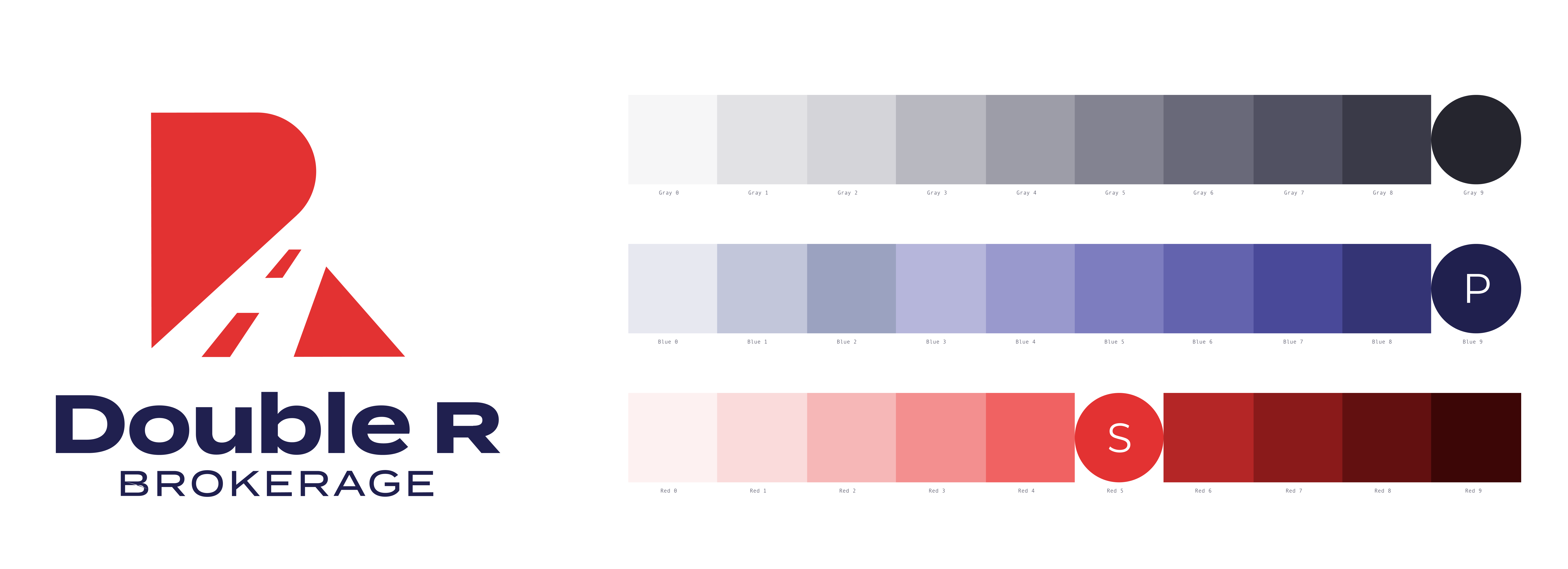
Brand Foundation: The Visual Language
I defined a "Trust-First" palette—utilizing deep navy and charcoal to symbolize stability and professional weight. To drive user behavior, I implemented a "Safety Orange" accent color, strategically reserved for high-priority Call-to-Actions (CTAs) like "Request a Quote." This color choice was intentional, mirroring the high-visibility gear used in the logistics field, which subconsciously reinforces the brand's connection to the industry.
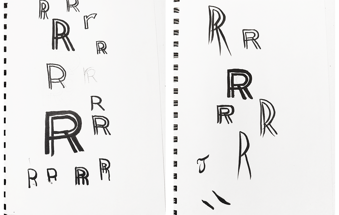
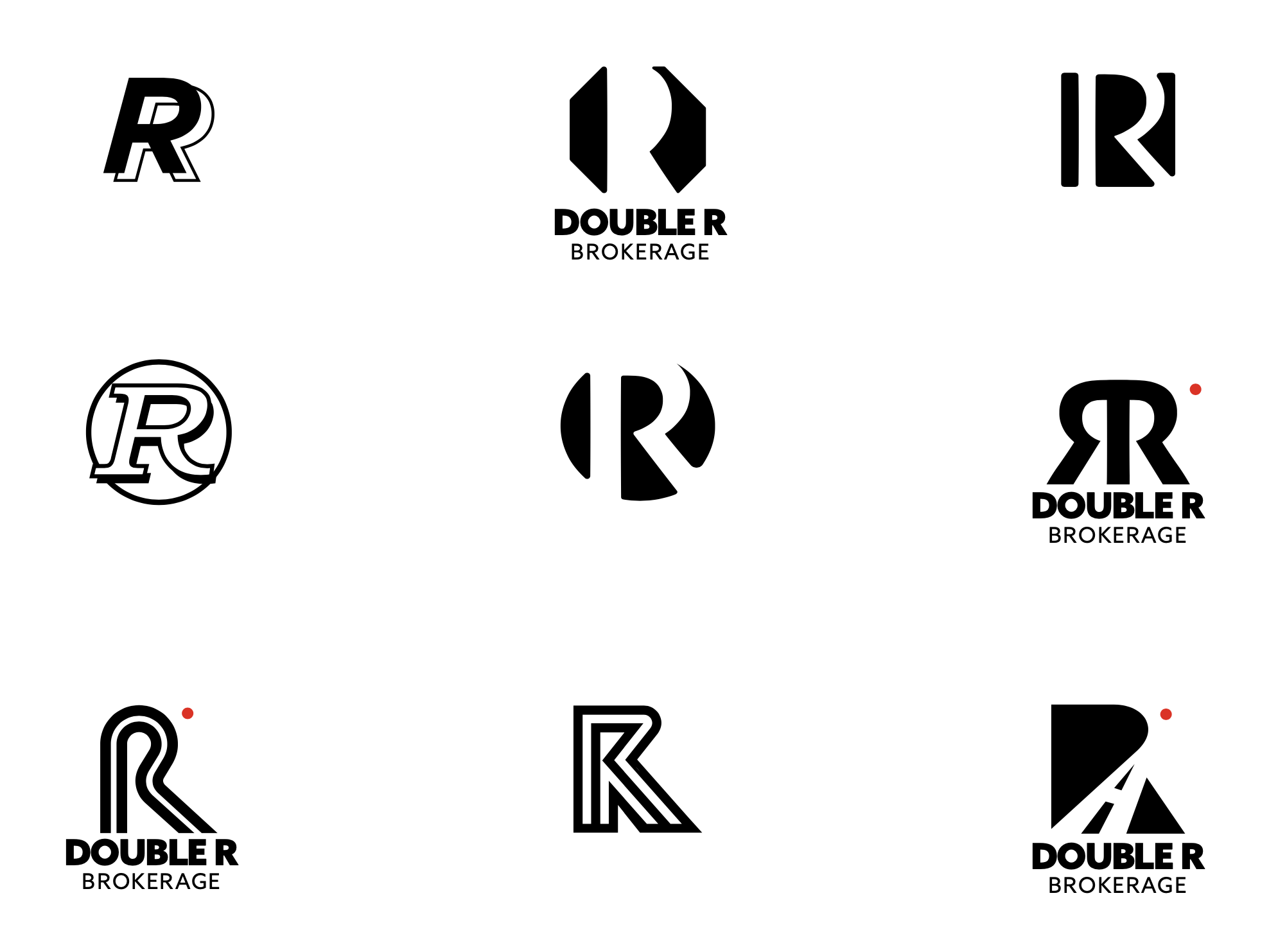
Logo Evolution & Symbolism
The logo design was an exercise in minimalist storytelling. I iterated on concepts that emphasized movement, connectivity, and the "Double R" initials. The final mark was designed with thick, stable line weights to suggest durability, while the interlocking nature of the typography symbolizes the critical link between shippers and carriers that Double R Brokerage provides.
UX Process: Designing for Lead Generation & High-Performance Dev
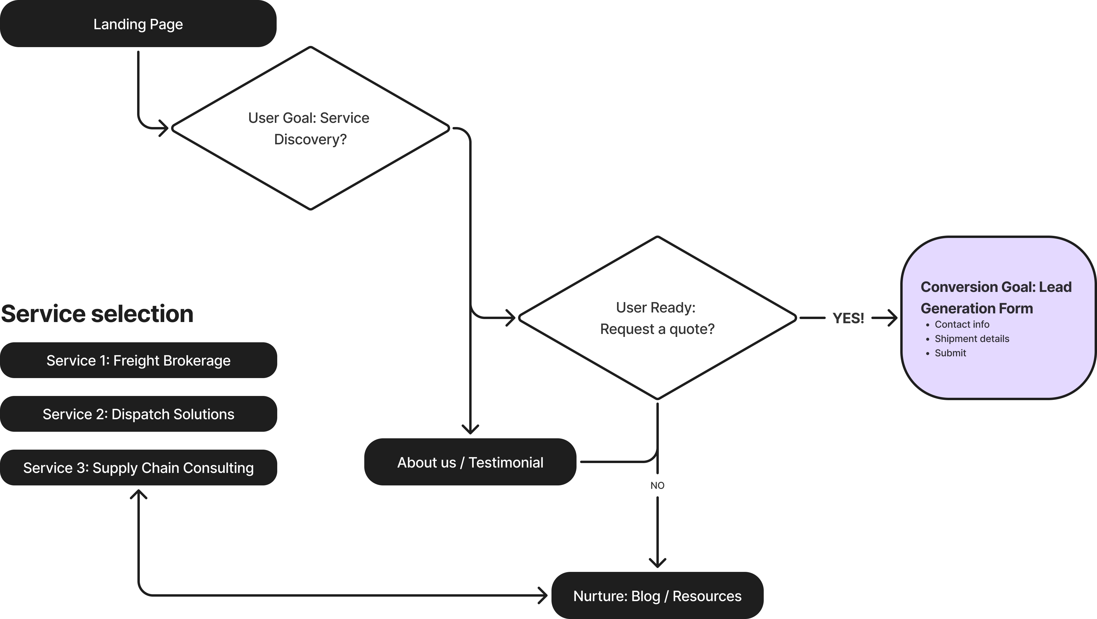
Architecting the "Trust Funnel"
In the B2B logistics space, users are often time-poor and looking for immediate answers. I architected the Information Architecture (IA) to act as a "Trust Funnel," moving users from high-level service discovery to a low-friction "Request for Quote" (RFQ) action in under three clicks. By prioritizing a clean, single-page-centric layout, I ensured that potential clients could validate Double R’s expertise (Freight, Dispatch, Supply Chain) without the cognitive load of navigating a complex directory.
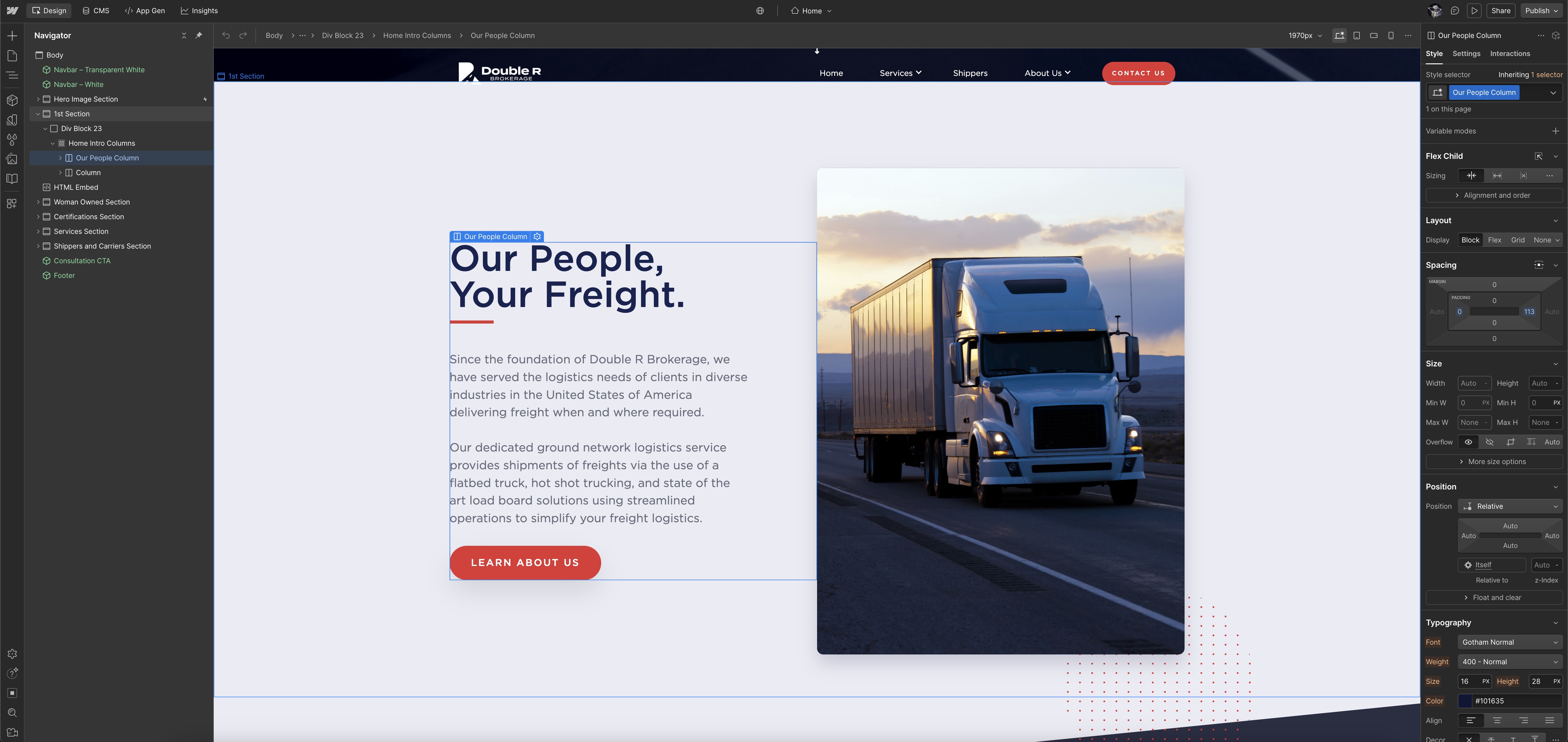
Design-to-Code: The Webflow Advantage
As the Lead Developer, I utilized Webflow to bridge the gap between static design and interactive reality. I didn't just "build a site", I engineered a responsive environment that utilized custom interactions and subtle parallax animations to provide a "premium" feel rarely seen in the logistics industry. This hands-on approach ensured 100% design fidelity—ensuring that the final live product was an exact, pixel-perfect match to my original creative vision across all device breakpoints.
A Production-Ready Digital Asset
Zero-to-One Launch Success
The primary impact of this initiative was the successful transformation of a startup concept into a live, professional B2B digital entity in a matter of weeks. By providing a complete "Brand-in-a-Box" and a high-performance website, I equipped the business with the necessary tools to compete immediately with established players in the logistics space.
Technical Execution & Scalability
Utilizing Webflow as the core engine allowed for a design-to-launch speed that traditional development cycles could not match. The final site achieved 100% design fidelity, featuring a fully responsive layout and custom interactions that communicate the "premium" nature of the service. The site architecture remains scalable, allowing for future expansion into a more complex CMS-driven service catalog or blog as the business grows.
Measurable Quality & Trust
The project resulted in a comprehensive Brand Kit (Logo, Typography, Color System, and Assets) that provides a consistent visual foundation for all future sales collateral. The live site serves as a tangible, interactive asset that proves the viability of my strategic designs in a real-world, high-stakes environment.
Reflections: The Power of Autonomy
- Holistic Ownership: This project reinforced my ability to lead the entire design and development lifecycle without external dependencies, proving I can manage complex brand strategy alongside technical implementation.
- Efficiency in Execution: I learned that for startups, a "design-to-code" approach in Webflow provides the perfect balance of custom high-end aesthetics and rapid market entry.