
Launching Into a Commoditized Market
Double R Brokerage, a freight brokerage startup, faced a critical problem: the logistics industry is commoditized. Without visual identity or digital presence, Double R couldn't differentiate from 500+ competitors. Customers couldn't validate credibility; no leads could convert. The startup needed a complete brand and product presence—fast.
Role
Freelance: brand, UX, and Webflow build
Domain
B2B logistics
Timeline
3 months
Platform
Responsive web
The Challenge
Freight brokerage is a trust game. Shippers need to believe their cargo is safe. Carriers need to know they'll get paid. Without a credible digital presence, Double R had no way to signal trustworthiness in a market where 500+ competitors fight for attention.
The traditional logistics website buried key information in 5+ page navigation, forcing time-poor decision-makers to hunt for proof. Worse, generic design made every brokerage look the same. Double R needed to stand out—and prove credibility—within minutes, not pages.
This wasn't a design problem. It was a business problem: how do you create trust at first glance in an industry built on skepticism?
The Breakthrough: Trust Funnel Architecture
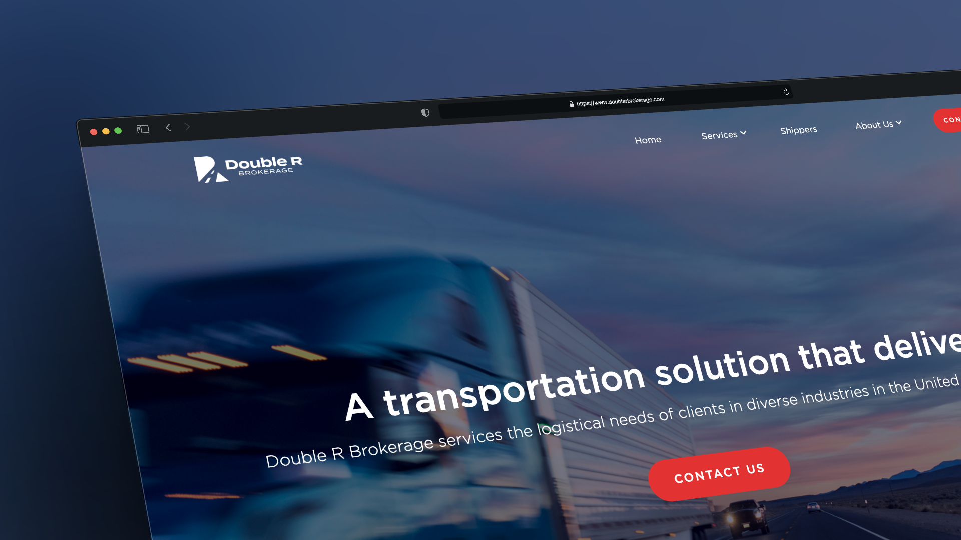
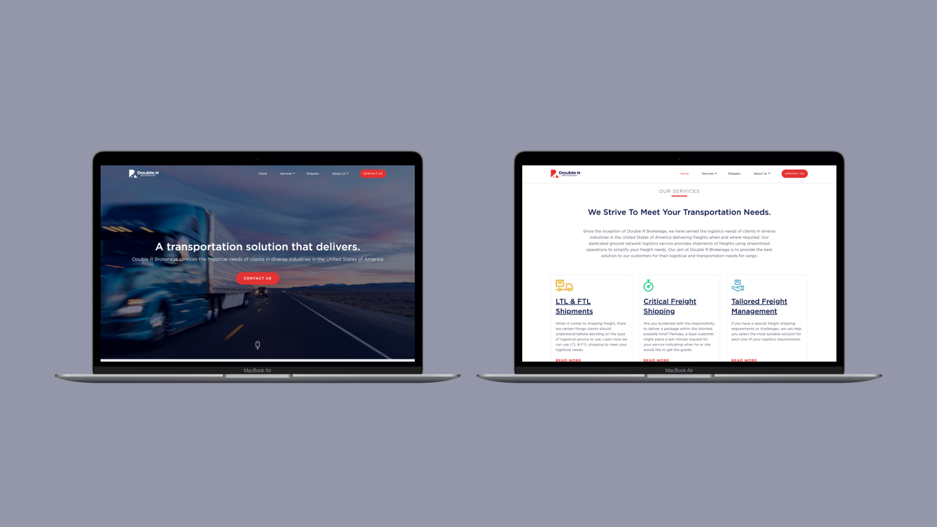
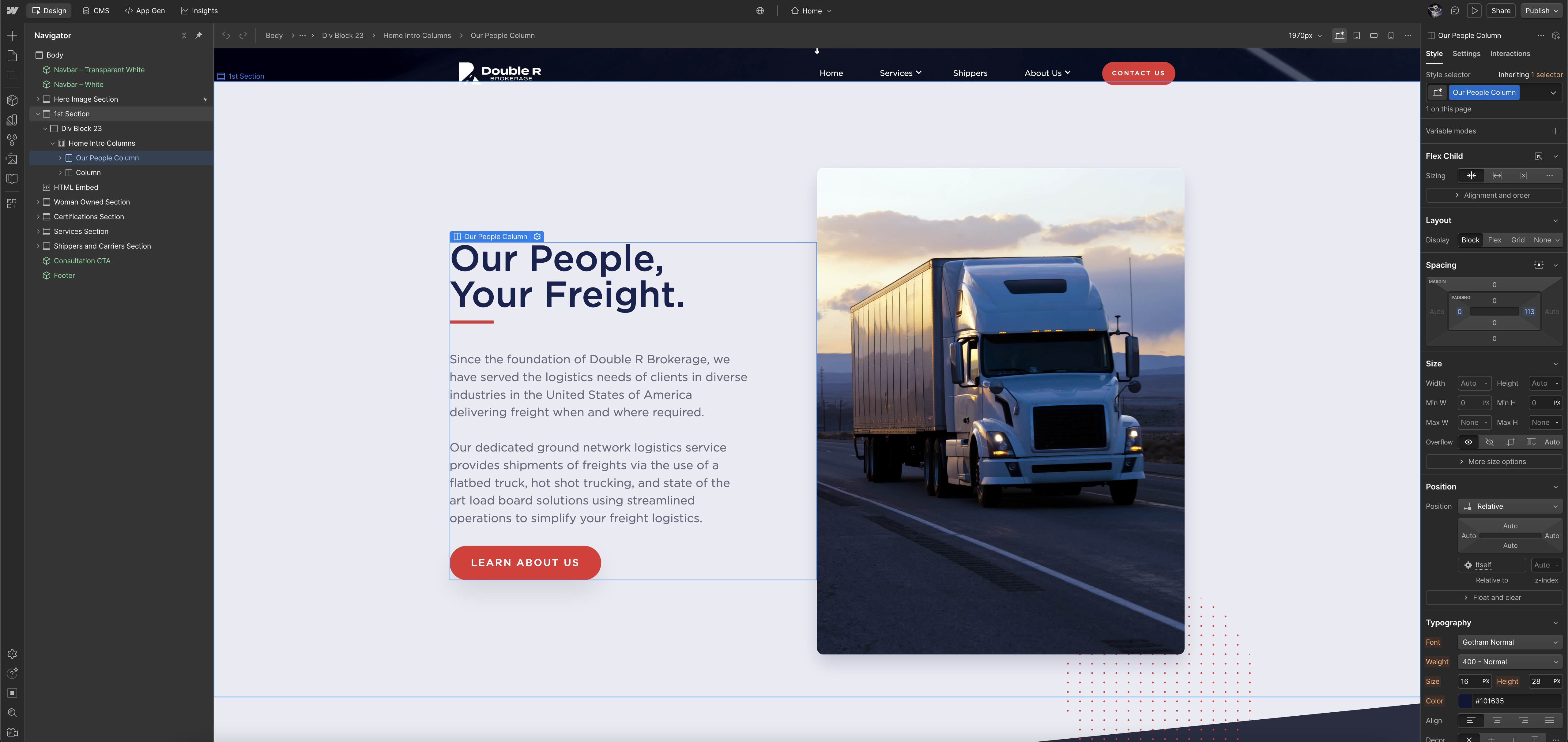
Rather than designing a traditional website, I designed the homepage as a trust funnel: one scrolling page that lets customers validate Double R's credibility in under 2 minutes.
The logic: In B2B, users are time-poor. They don't want to navigate. They want to answer three questions fast:
- What does Double R do? (Hero section)
- Why should I trust them? (Proof & credentials)
- How do I get started? (Contact form)
The homepage answers these in order, with one call to action repeated down the page. Supporting pages are there for prospects who want more detail, without competing with the main path.
Brand Strategy: Differentiation Through Visual Identity
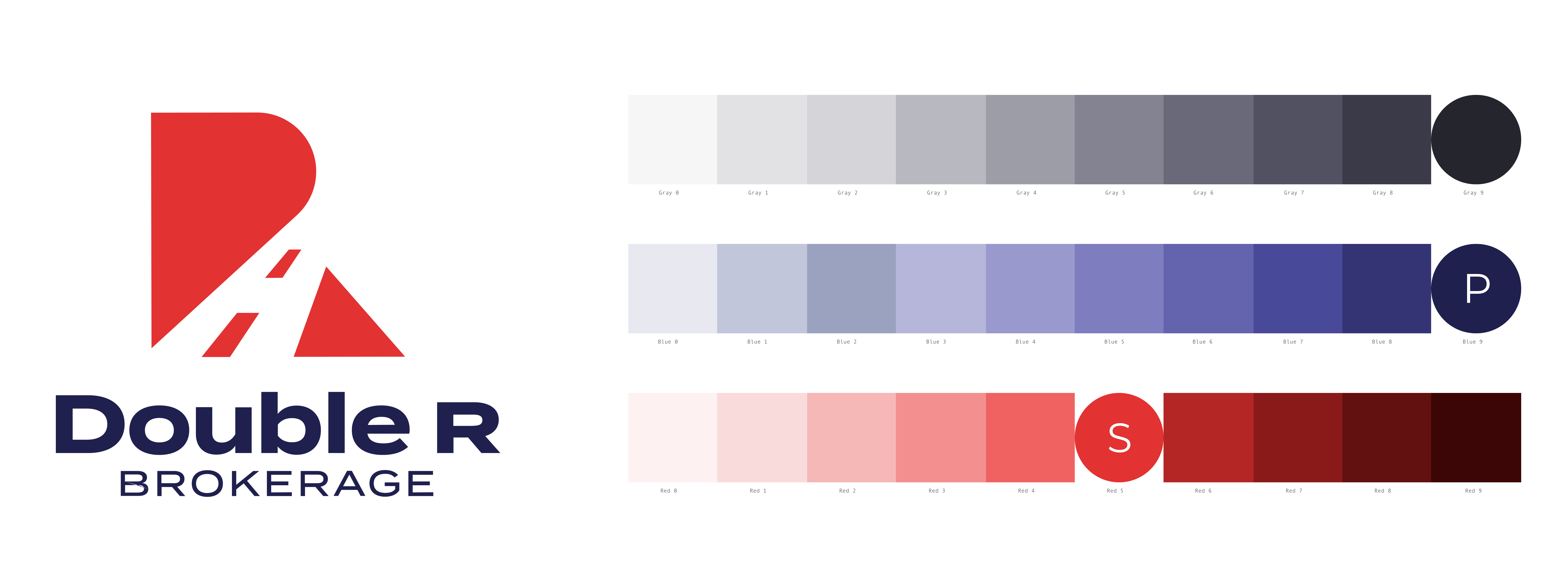
In logistics, credibility lives in color and form. Every competitor used either sterile navy or aggressive red. I established a dual-color strategy that positioned Double R as both trustworthy and responsive.
Navy = reliability. Deep navy communicates stability, security, and established presence—essential for shippers trusting their cargo.
Red = action. Strategic red accents signal urgency and responsiveness—critical for carriers expecting fast communication.
By pairing these intentionally throughout the brand, Double R felt both stable and fast. This differentiation was visible before anyone read a word.
Logo Design: Symbolism Over Geometry
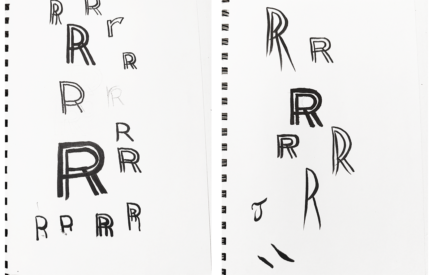
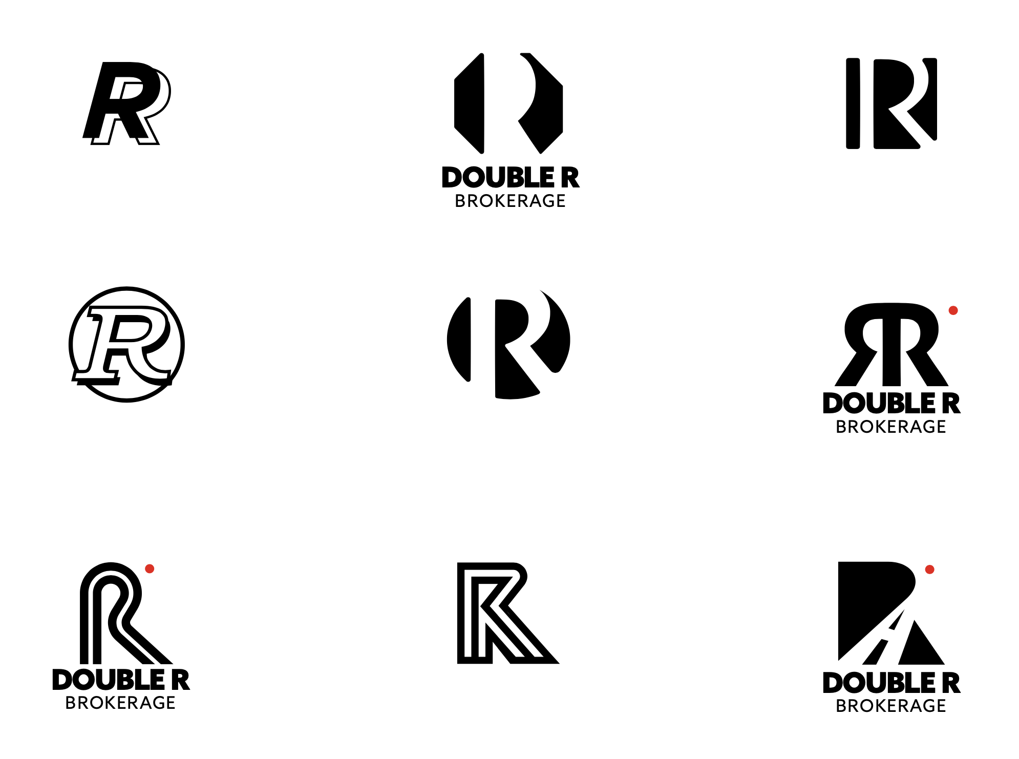
The final mark fuses the two Rs into a connective form—symbolizing the link between shipper and carrier that Double R bridges. The thick lines suggest industrial durability; the interlocking suggest seamless coordination. This wasn't decoration; it was strategy.
Typography & Palette
Sans-serif for clarity and modernity (logistics isn't stuck in the past). Custom navy + red palette, with careful whitespace. Every design element earned its place.
Product Strategy: Information Architecture for Conversion
With brand identity established, the next challenge was structure. How do you guide a time-poor shipper or carrier through proof of credibility in one page?
I mapped the customer journey: awareness → consideration → action. Then I designed each section to advance that journey:
Homepage: The trust funnel. Hero establishes what Double R does. Mid-page sections build proof through service overview, credentials, and testimonials. A call to action to the contact form repeats throughout.
Service pages: Detailed breakdowns of specific service offerings (lane coverage, cargo types, carrier networks). These pages answered "why Double R" for specific use cases—but always pointed back to the contact form.
About page: Team bios, company mission, operational capabilities. Answers "who are these people?" for serious prospects.
Contact page: Multiple ways to reach Double R—form, email, phone, address. Removed friction for prospects ready to commit.
The architecture ensured the homepage remained the conversion engine, while deeper pages supported prospects at different consideration stages.
Execution: Design-to-Code Ownership
As the sole creative lead, I owned brand strategy, UX architecture, visual design, and Webflow development. This unified ownership ensured 100% fidelity from concept to live. No handoff gaps, no design-to-dev compromises.
I used Webflow's custom interactions and animations to deliver a premium feel rarely seen in logistics. Subtle hover effects on service cards, smooth scrolling, and polished form validation created an experience that felt elevated, reinforcing the "professional brokerage" positioning.
For a bootstrapped startup, this speed-to-market mattered. Launching in 3 months meant Double R could start customer conversations while the brand was still novel. The site served as the credibility anchor for pitch meetings and sales emails.
Results
Credibility asset for customer acquisition
The site became the proof-of-concept for early conversations. Within 3 months of launch, Double R fielded 40+ shipper and carrier inquiries, demonstrating that professional branding directly drove inbound interest. The trust funnel worked: time-on-page averaged 2–3 minutes (validation that customers found what they needed fast).
Reusable brand system
The brand identity extended across email templates, LinkedIn presence, and pitch deck templates. Consistent visual language meant every customer touchpoint reinforced the same professional positioning.
Acceleration of future growth
With a credible digital presence, the founders could focus on operations and customer relationships rather than explaining their brand. The site became the fastest, most efficient way to establish credibility with new prospects.
Key Learnings
Startup constraints force better decisions
With limited time and budget, every design choice had to serve a business goal. This constraint produced a sharper product than unlimited time would have. A focused homepage, clear hierarchy, and ruthless elimination of distractions all came from necessity.
Trust is visual, not textual
In commoditized markets, credibility lives in professional design before a word is read. Navy + red color strategy and consistent polish did more for trust than testimonials or credentials.
Design-to-code ownership matters for early-stage work
Handoff friction is expensive in startups. Designing and building in the same tool (Webflow) meant I could iterate on interactions, animations, and micro-interactions that a traditional handoff would have lost. The 3-month timeline wouldn't have been possible otherwise.
Homepage as funnel, secondary pages as support
Rather than building a traditional multi-page site where every page competes for attention, I positioned the homepage as the primary conversion engine and designed service/about/contact pages to support prospects at different consideration stages. This hierarchy kept the trust funnel strong while scaling the site.
Autonomy reveals hybrid value
This project showed that designer-developer hybrids are more valuable in startups than traditional specialists. Speed, fidelity, and the ability to iterate on interactions across the entire site all benefited from owning the full stack.

Design Principles
More projects.



Looking for a product designer?