
Scaling Quality at Enterprise B2B
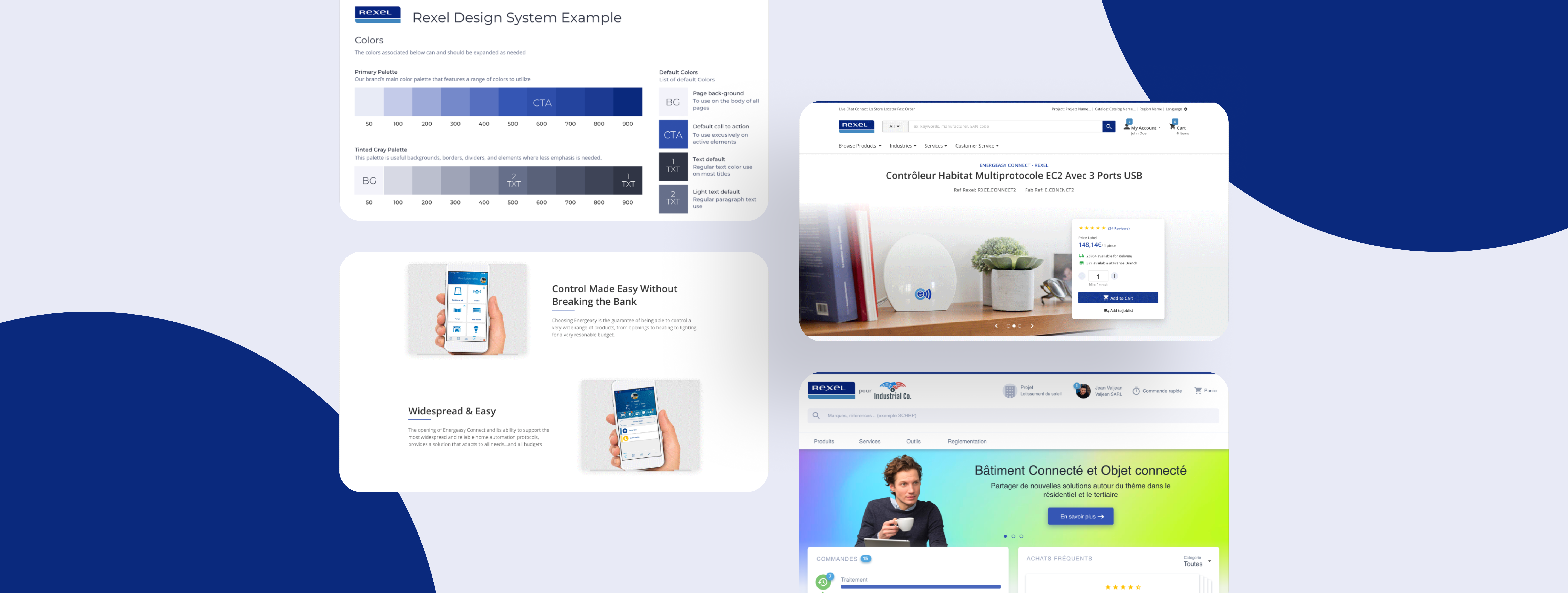
Rexel USA faced a critical challenge: its e-commerce platform had accumulated significant design debt across 50+ inconsistent components, slowing feature velocity and creating compliance risk. To remain competitive and enable rapid product expansion, they needed to unify their design language while maintaining the flexibility to serve multiple customer segments and brands.
Role
Design System Lead
Domain
Enterprise B2B e-commerce
Timeline
9 months
Platform
Web & mobile
The Challenge
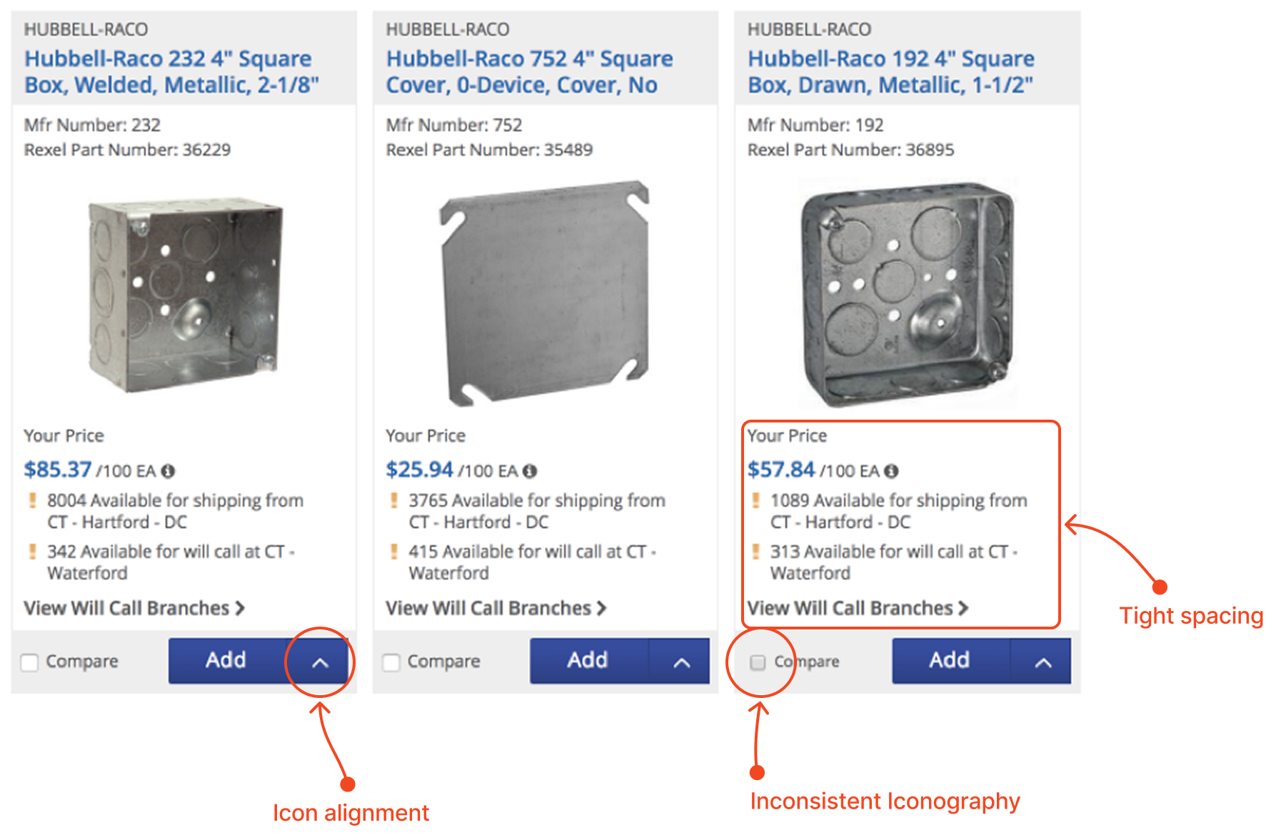
Rexel's e-commerce platform had grown organically over time, resulting in fragmented design patterns, redundant components, and inconsistent customer experiences. The design debt was measurable: feature teams spent a large share of their development time rebuilding or working around inconsistent patterns instead of shipping new functionality. Compliance with WCAG 2.1 accessibility standards was inconsistent across the platform, creating legal and brand risk.
The core problem wasn't just aesthetic inconsistency, it was organizational inefficiency. Without a unified source of truth, every new feature required design decisions that had already been made elsewhere.
The Breakthrough: Design System as Organizational Infrastructure
Rather than treating the design system as a design team deliverable, I reframed it as organizational infrastructure. Instead of designing a component library in isolation, I designed a governance model that would allow product teams to adopt, adapt, and contribute back to the system. The system became a tool for scaling consistency without centralizing all decisions.
Translating Fragmentation Into a System
Success required alignment across Product, Engineering, Design, and Compliance. I led discovery workshops to inventory existing patterns, identify gaps, and establish design principles that would guide future decisions.
What we defined together:
- Component audit (cataloged 150+ patterns across the platform, identified 40+ redundancies)
- Design principles (consistency without uniformity, accessibility-first, flexible theming for multi-brand support)
- Governance model (who proposes components, how they're reviewed, deprecation strategy)
- WCAG 2.1 compliance requirements built into component specifications
By establishing governance early, we reduced future rework and created a framework that teams could scale independently.

Proving the System Works: High-Impact Redesigns
To validate the system before full rollout, I applied it to three high-impact redesigns: the Product Listing Page (PLP), the Checkout Experience, and the Account Management dashboard. These weren't just visual refreshes—they were proof that the design system could solve real product problems at scale.
The PLP Redesign
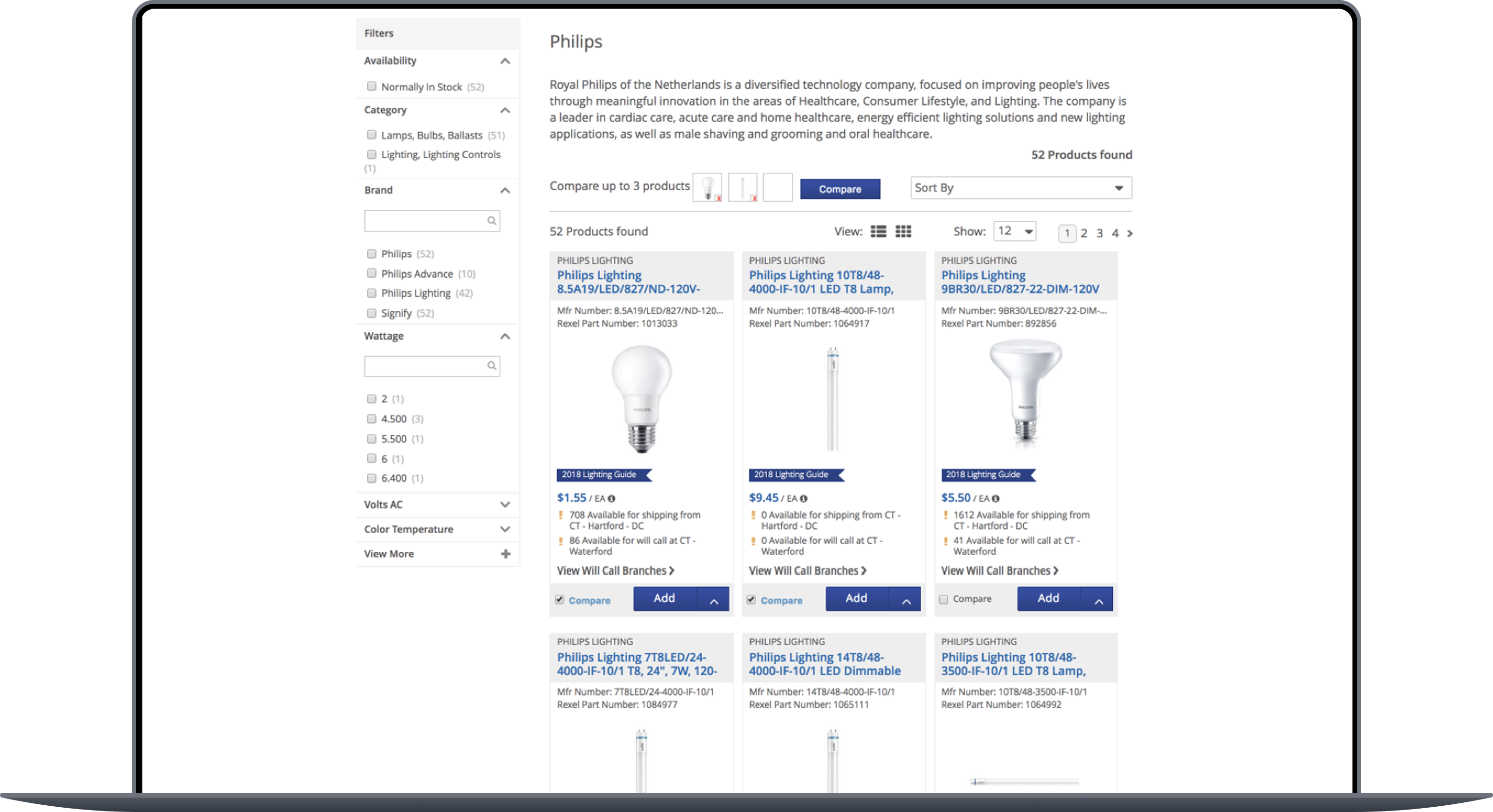
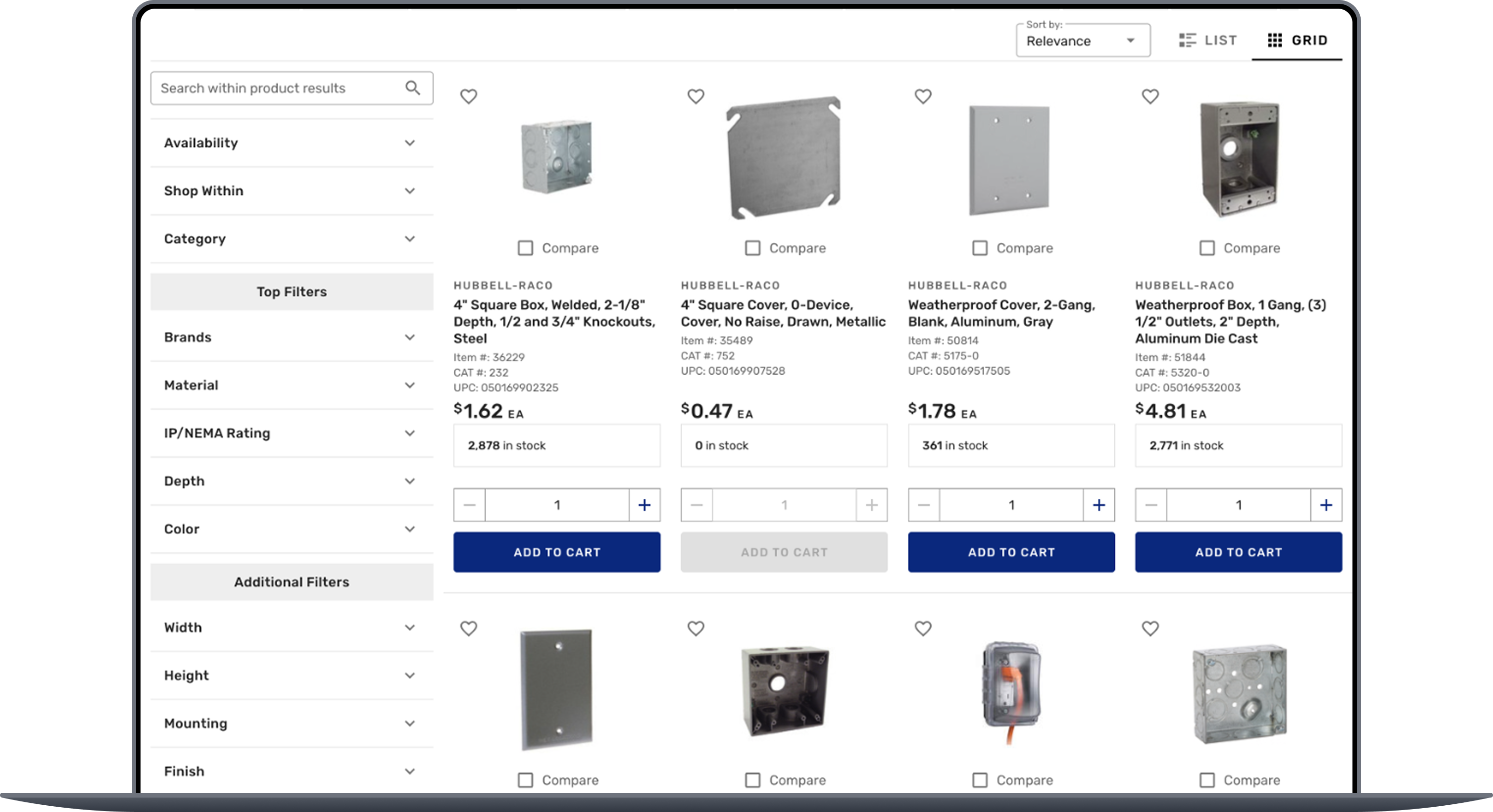
The original PLP had accumulated multiple filter interactions, sorting approaches, and result layouts that created cognitive overload. Using the unified component system, I redesigned the PLP to be simpler, faster, and more accessible—while reducing front-end code by 35%.


Reducing Design Debt at Scale
The audit revealed the true cost of fragmentation: 60% of the component library was redundant or could be consolidated. By establishing a single source of truth and deprecating legacy patterns, we significantly reduced the design system codebase while expanding capability.
More importantly, this freed up team capacity. Front-end build time dropped by 40%, meaning developers spent less time styling and more time on feature logic. Designers stopped rebuilding buttons and started solving customer problems.
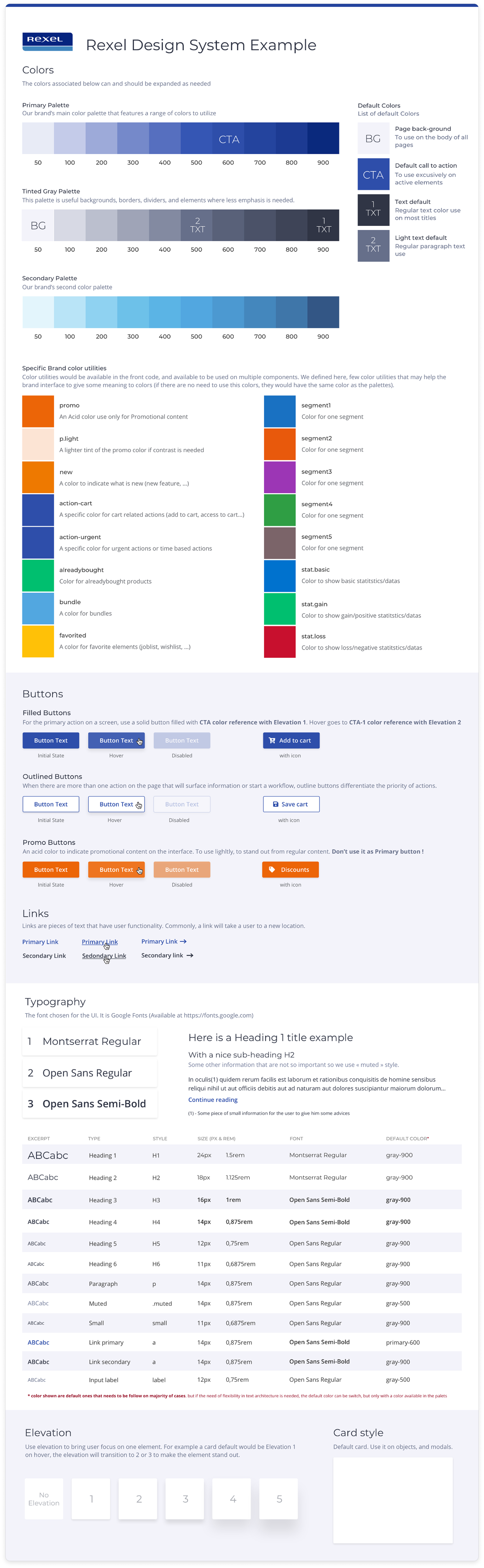
Multi-Brand Scalability
Rexel operates multiple brands and customer segments. Rather than forcing one-size-fits-all, I designed the system with flexible theming that allowed brands to maintain visual identity while sharing the underlying component architecture.
This meant creating a token-based design system where colors, typography, and spacing could be overridden per brand, but component structure remained consistent. Product teams could launch for a new brand in weeks instead of months.
Results
Accelerated Feature Velocity
The 40% reduction in front-end build time didn't just improve efficiency, it transformed what the organization could ship. Teams that previously delivered one feature per quarter could deliver 3-4. In Q3 alone, three major product launches were shipped using the design system, expanding market reach to new customer segments and geographies.
Reduced Compliance Risk
Accessibility compliance became built-in rather than bolted-on. By establishing WCAG 2.1 compliance as a component-level requirement, every new feature shipped with baseline accessibility standards. This eliminated the audit risk and improved the platform experience for all users, particularly those using assistive technologies.
Established Organizational Standard
The design system became the organizational standard for how product gets built at Rexel. This meant future teams inherited not just a component library, but a decision-making framework, a governance model, and a culture of consistency.
Key Learnings
Governance matters more than perfection
The most important decisions weren't about which shade of blue to use, they were about who decides and how teams collaborate. A well-governed imperfect system scales; a perfect system without governance becomes stale and fragmented.
Design debt is organizational debt
Inconsistency isn't a design problem; it's a symptom of unclear standards and misaligned teams. Fixing the system means fixing the organization's decision-making process.
Systems scale through contribution, not centralization
Rather than design teams creating and teams consuming, I designed a bidirectional system where product teams could propose components, designers reviewed them, and the system evolved based on real product needs.
Theming enables scale without compromise
Multi-brand support could have meant custom designs for each brand. Instead, a token-based theming approach let brands maintain identity while sharing 90% of the component architecture, reducing rework by 60%.
Accessibility-first creates better products
Building WCAG 2.1 compliance into components from day one didn't slow development, it accelerated it. Teams stopped treating accessibility as a late-stage concern and made better design decisions upfront.
Design Principles
More projects.




Looking for a product designer?
