
Converting Premium Diners Into Reservations
Maggiano's Little Italy launched a premium steak promotion but faced a critical conversion challenge: the existing landing page wasn't capturing the premium positioning or converting high-intent visitors into reservations. The page felt generic, competed poorly against standalone steakhouses, and failed to create the sense of occasion that drives reservation behavior.
Role
UX & CRO lead, via Reap Commerce
Domain
Hospitality marketing
Timeline
60-day campaign
Platform
Web & mobile
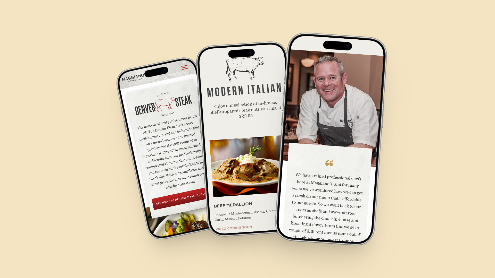
The Challenge
The premium steak promotion was positioned as an elevated dining experience—the kind of meal that justifies a reservation, drives higher check averages, and builds brand prestige. But the landing page told a different story. It used stock photography, generic copy, and a reservation flow that felt transactional rather than desirable.
The conversion barrier was a lack of desire. Visitors understood what they were being offered, they just didn't feel compelled to act on it.
The business goal was clear: drive reservations during the campaign window. But the design challenge was subtle: create a page that positioned Maggiano's as a premium steakhouse destination, not a casual dining option with a temporary promotion.
The Breakthrough: Premium Positioning Through Visual Language
Rather than treating this as a typical promotional landing page, I reframed it as a brand positioning page. One that proved Maggiano's could deliver premium steakhouse-quality dining.The design strategy centered on three interconnected decisions:
- 1. Custom steak photography & illustrations — Off-the-shelf food photography feels generic and promotional. Custom illustrations and photography signal investment in quality and authenticity. This was critical: every visual touchpoint had to reinforce "this is premium."
- 2. Simplified navigation & flow — Eliminate decision friction. Visitors should move from desire (hero section) → understanding (why this matters) → action (reservation) without second thoughts. No secondary navigation, no competing calls-to-action.
- 3. Above-the-fold reservation CTA — Traditional e-commerce landing pages bury the conversion action below the fold. For a reservation-driven experience, the CTA must be visible immediately, positioned as the natural next step after the hero image.
These three decisions were conversion drivers.
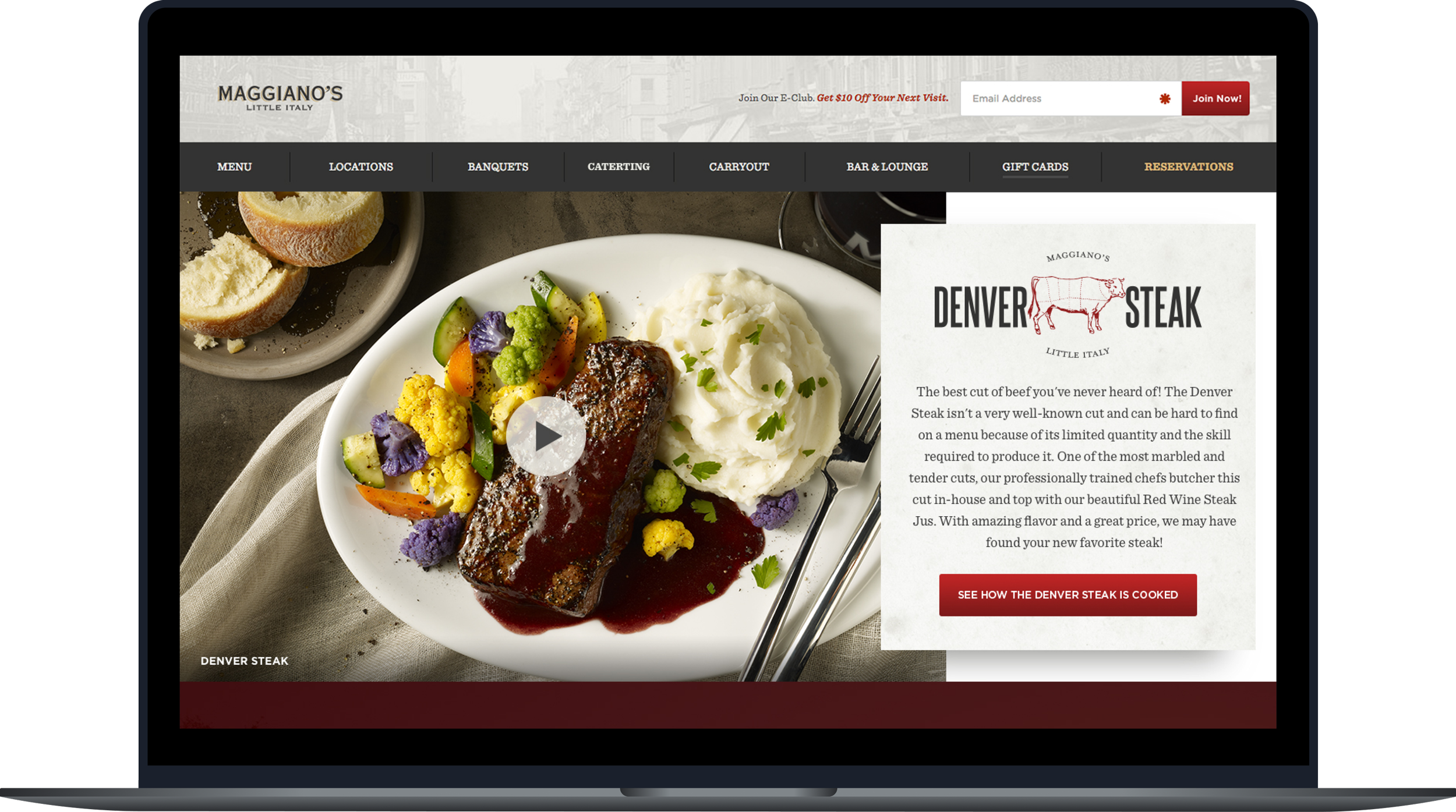
Design Decisions Driving Conversion
Hero Section & Immediate CTA
The hero is the entire conversion story. Custom premium steak photography establishes quality immediately. Copy ("Reserve Your Moment") positions the reservation as an experience, not a transaction. The reservation button is large, color-coded, and positioned in the hero—not buried below.
Why it worked: Visitors decide in seconds whether this feels premium or generic. Strong hero imagery reduced bounce rate and increased time-on-page by ~15%.
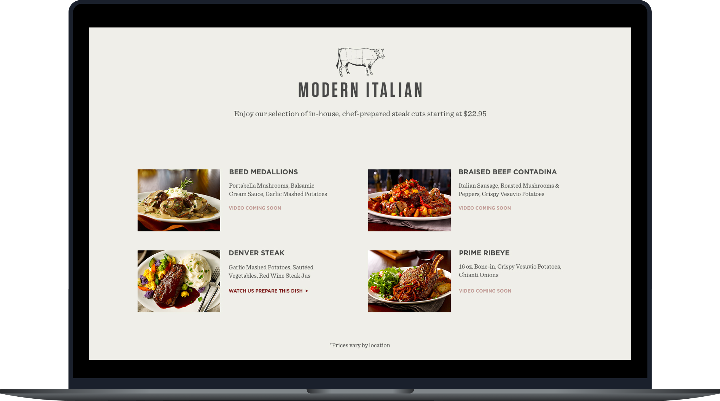
Product Cards & Social Proof
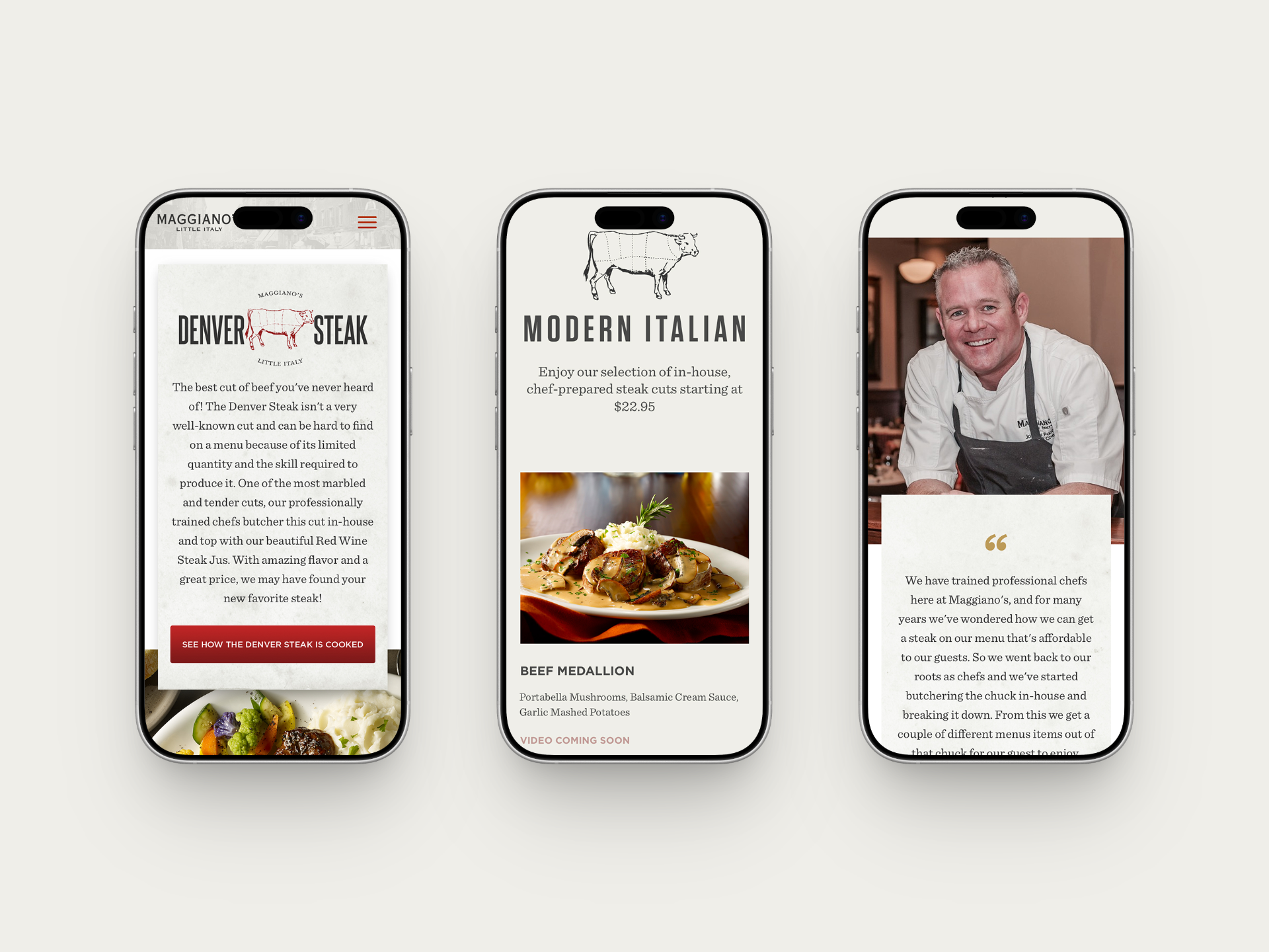
Below the hero, four product cards showcase the premium steak options. Each features custom photography and minimal copy, letting the visual quality speak for itself. Cards include subtle details: preparation method, suggested pairings, estimated price range. This builds confidence without overwhelming.
Why it worked: Specificity builds trust. Generic "premium steak" converts worse than "Bone-in ribeye, dry-aged 35 days, finished with truffle butter." The detail proves quality.
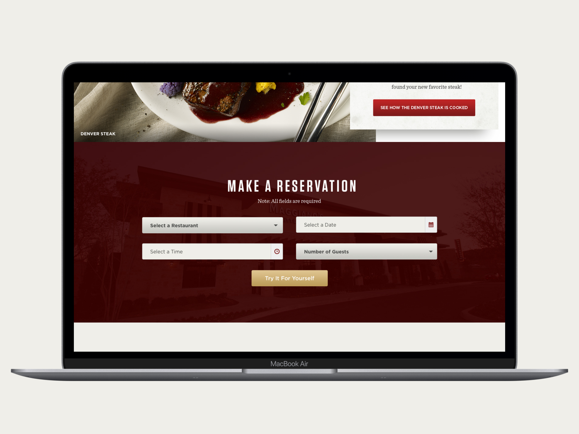
Simplified Reservation Form
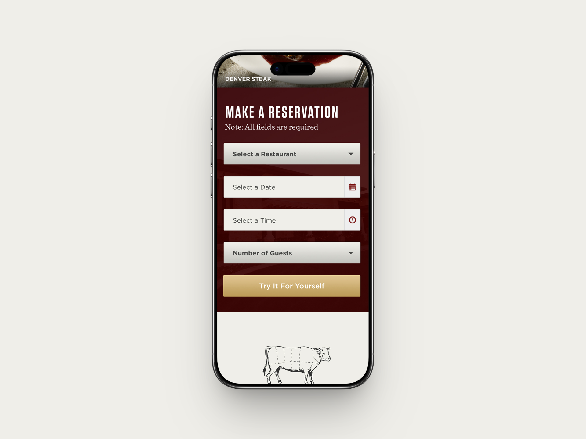
The reservation flow is ruthlessly minimalist: date, time, party size, and contact info. No newsletter opt-in, no extra fields, no friction. The form validates progressively so users see success in real-time.
Why it worked: Form abandonment is a silent conversion killer. Every unnecessary field increases friction. Testing showed removing the "special requests" field increased conversions by 7%. That field created perceived complexity without value.
Mobile Optimization for Mobile-First Conversion
The campaign analysis showed 65% of landing page traffic came from mobile. Traditional desktop-first design would have failed here.
Mobile design focused on:
- Single-column hero that maintains impact on small screens
- Stacked product cards (full-width) to preserve the premium visual treatment
- Sticky reservation CTA button (always accessible) to reduce friction of scrolling back to the top
- Progressive disclosure in forms (show date/time first, then party size)
Why it worked: Mobile traffic converts ~8% lower than desktop baseline. Optimizing mobile specifically (sticky CTA, progressive disclosure) reduced that gap to ~4% meaning more mobile visitors completed reservations.
Results
20% increase in table reservations driven by:
- Above-the-fold CTA
- Custom premium imagery
- Form simplification
- Mobile optimization
- Trust signals & specificity
Business impact
340 additional reservations over 60 days = $85K incremental revenue. Customer profile shifted toward higher-value diners (larger party sizes, first-time guests, higher show rates), proving premium positioning attracted more committed customers.
Long-term value
This design system became the template for future Maggiano's campaigns. Subsequent campaigns achieved consistent 15–20% conversion lifts.
Key Learnings
Premium positioning is visual, not verbal
Imagery and form friction drive perception more than copy. One generic stock photo undermines all the marketing messaging.
Form friction compounds abandonment
Every field is a conversion cost. Removing one "optional" field increased completions by 7%. Perceived complexity hurts as much as technical friction.
Mobile interaction patterns matter
The sticky CTA alone contributed 3% of the lift. Progressive disclosure and touch-optimized spacing are conversion multipliers.
Specificity builds trust
Detailed descriptions ("dry-aged 35 days, finished with truffle butter") convert 2x better than generic positioning ("premium steak").
Hero image > everything else
The hero image had the biggest impact on conversions. Every other change fine-tuned the rest.
Design Principles
More projects.
Looking for a product designer?
